Overview:
Context & Background
The original screener was powerful, but overwhelming — packed with advanced filters, dense tables, and little guidance. New users often didn’t know how to start, what filters to use, or how to generate useful insights. Many abandoned the tool before experiencing its value.

Problem
The product lacked clear onboarding, didn’t support users' mental models, and failed to show value early. This resulted in low conversion to Elite and a long learning curve.
Constraints
The redesign needed to:
Reduce friction and time-to-insight
Highlight Elite features without being pushy
Improve accessibility and usability, especially for novices
Be desktop-first, but eventually scalable to mobile
Align user needs with business goals (e.g. faster Elite upgrades)
Research & Insights
Approach
I explored representative tasks and studied current user behavior. I mapped user journeys and conducted a competitive analysis to understand what works elsewhere.

Key Insights
New users struggled with where to start
Users wanted ready-to-use templates, customization, and guidance
Advanced users wanted speed, control, and deeper insights
Users upgraded to Elite mostly for ad-free experience, alerts, and expert content

Design Process & Iterations
Early Exploration
I mapped out core tasks and user intent across skill levels. I focused on how users move from curious to confident, and how to surface value fast.
Event Mapping
I defined success triggers (e.g. saving a screener, creating alerts) and mapped opportunities to nudge users toward Elite features without disrupting the flow.
Iterations
After testing the first prototype, I gathered feedback from novice users who struggled with visual overload and navigation hierarchy. Based on their input, I refined the UI to be cleaner, more accessible, and less intimidating — improving contrast, spacing, labeling, and simplifying filter interactions. The redesign better supported both casual and advanced users without compromising flexibility.
Solution & Key Features
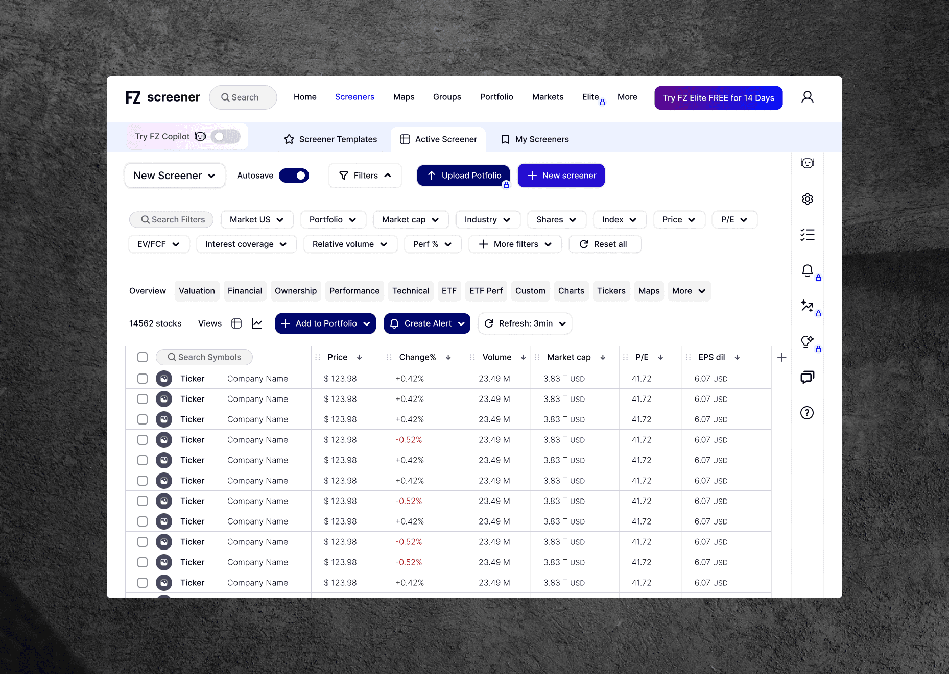
Final Concept: A cleaner, modular screener with three entry points and an optional AI copilot to guide users based on their goals.
🔹 Three Tab Structure
Screener Templates – ready-to-use screeners sorted by market trends and popular use cases
Active Screener – real-time filters and results, with AI suggestions to build or modify queries via natural language
My Screeners – save, manage, and customize screeners and portfolios
🤖 AI Copilot (Optional)
Suggests templates in Screener Templates
Helps build screeners with natural language in Active Screener
Recommends tweaks and similar screeners in My Screeners
💎 Elite Highlights
Upload portfolio to auto-generate screeners
Advanced filters, expert templates, and alert system
14-day free trial CTA, and locked features that look enticing to try
Outcome & Impact
Design KPIs
↓ Time to first insight
↑ Screener saves and edits
↑ AI Copilot engagement
↓ Drop-offs in first 5 minutes
↑ Conversion to Elite within 21 days (target goal)
Prototype Feedback
“I finally know where to start.”
“Love that I can just ask AI to help me filter.”
“The Elite stuff now feels worth it — and not annoying.”
Takeaways & Reflection
What I Learned
Making a tool smarter doesn’t mean making it more complex. Novice users need clarity, not clutter. Power users want speed and precision. You can serve both — as long as you design with intention and flexibility.
What’s Next
I’d love to bring this kind of human-centered clarity into other data-heavy tools — especially in finance, AI, or productivity.