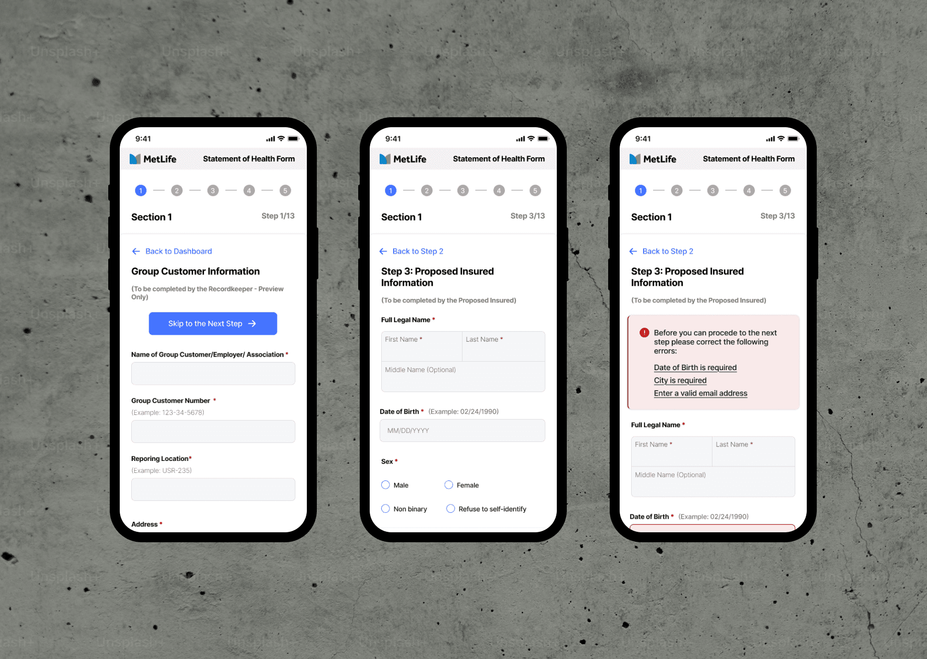

Overview:
Context & Background
Many large global insurance companies still rely on outdated, paper-based workflows. A common flow: download a 20-page PDF, print it, fill it out manually, sign it, and mail it back. This process is slow, expensive, and riddled with human error.
Problem
The experience is overwhelming, time-consuming, and inaccessible — leading to high abandonment rates, incomplete or inaccurate submissions, and significant delays in processing.
Constraints
My redesign needed to:
Improve completion and accuracy rates
Be fully accessible (WCAG 2.2 AA)
Support 8 languages
Comply with CCPA/GDPR
Reduce friction and error for both users and internal ops
PDF Insurance intake forms:

The Approach
I audited the original PDFs and mapped out conditional logic. I also studied real user pain points across the insurance space through secondary research and usability patterns.
Key Insights
Forms were intimidating, especially for older users
Most users feared making critical mistakes
Mobile abandonment rates were extremely high
Real-time feedback, progress tracking, and edit options were missing

Design Process & Iterations
Initial Steps
I broke down the original form’s IA and restructured it into digestible, conditional steps. Non-relevant fields were hidden unless triggered.
Workflow
Created a guided user flow
Built a component-based design system
Prototyped & tested a multi-step experience for both desktop and mobile
Iterations
Refinements included inline validation, error recovery states, and a clear final review screen. All tested for clarity, efficiency, and ease of use. I moved away from a static form model to a dynamic digital experience — focusing on clarity, context, and control at every step.
Solution & Key Features
Final Experience
Guided step-by-step flow (mobile & desktop)
Real-time error feedback
Auto-save, resume later, and post-submission edit/withdraw options
Clear final review screen before submit
Completion time under 7 minutes for standard (n0n-complicated medical history) cases
Boosted completion rates by 50%
Cut average submission time by 75%
Reduce customer support load by 45%
Improve user trust and confidence
Takeaways & Reflection
What I Learned
Digital transformation isn’t just about replacing paper with pixels — it’s about making the experience frictionless. It’s about adapting the product to how people think, what they need, and how they behave. A well-designed digital form feels invisible — it simply guides users through, clearly and confidently.
What’s Next
I’m excited to apply these learnings to other industries still buried in paperwork — from healthcare and legal to finance and government.


